
I created this flyer using Photoshop CS6, it is a basic promo flyer built with layers, images, and text. I have learned that successfully creating a flyer in Photoshop requires the use of layers....many layers!! In order to keep up with my layers I create groups to put them in to keep everything nice and neat. I start with a white background and I either duplicate or click the new layer button below the layers panel. The layers in the picture below are turned off, all except the text group, to highlight the fact that you can put layers into groups in order to keep them in tact. I also noticed that you cannot put certain layers in groups without repositioning the layer. As I continue to learn photoshop, I guess I will find out another way to do this. So I started with a white background, added a new layer and made the stripes below....moving on...
 |
| Screen shot of all the layers and a group of text |
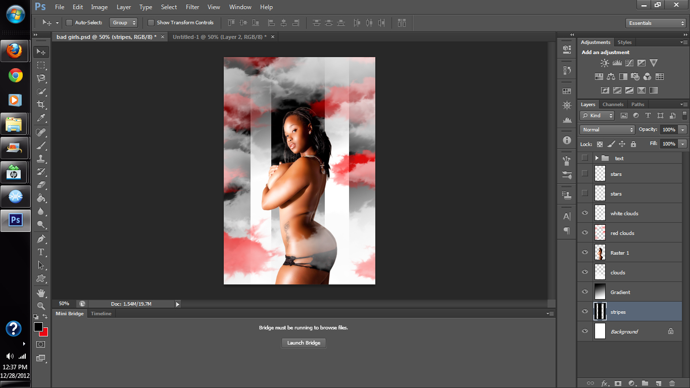
In order to have the flyer come together you have to add the model, the text the gradient, the stripes....whoa.... ok! Let's start with the stripes I created a layer and with black stripes I eventually named the layer stripes as you will see in the next photo. This layer will serve as the background as will the gradient. If you look at the finished product above you will see that in the background there are red and white clouds, stars. These stripes were created by selecting the rectangular marquee tool sizing it and filling it in with the paint bucket. I did three big stripes and filled the in with black.
 | |
| stripes |
 |
| Gradient |
Next, I incorporated a gradient into the background and set the blending mode to hard light so that you can see the stripes come through the gradient. Photoshop is an awesome tool to have to help you build a successful career in graphics, once you start to work with Photoshop it'll become an everyday part of life! Ok, so to add the gradient I just added another layer and selected the gradient tool and applied the gradient the layer. I went to the blending mode selection bar above the layers panel and chose hard light to make the gradient color a bit darker.

Afterwards I created another layer and named it clouds, then I went to my brush tool and selected the clouds brush, I got these brushes online there are a lot of websites that have brushes for Photoshop that you can download, some of the sites I visit are
and http://www.brushouse.com/special-effects-brushes/download-cigar-smoke-brushes-for-photoshop-cs6/
There are so many sites, if you google "brushes for photoshop" I am sure you will find what you're looking for.

After that, I inserted an image of a model, I found this image on www.officialpsds.com this is a site where you will find images that are already extracted and ready to use for Photoshop, it is a graphic designer's dream come true! Cuts out a lot of time, even though I like to check out the edges for myself, I can't say I have a complaint about this website, they basically have everything you need. All I had to do was move the image into the one I was working on and scaled it down to fit into my workspace.
So you will see in the bottom screenshot that I added the model on top of the clouds later on she will blend in with them.I left the blending mode at normal, but I didn't rename the layer, I left the name at Raster 1. You can always name layers so that it will be easier to locate. I, on the other hand was rushing so I didn't, Good thing is I can always go back and change the name before I save it.

I added the some more clouds with the brushes that I downloaded, and changed the colors to red to give it a pop of color, I mean black and white can be so boring at times, so any bold color can spruce it up. I added the red by just changing my background color, which changed the color of the brush.
As you can see it really made the entire flyer stand out already, even without the words. 
Here I just added some more clouds on top of those by just creating another layer and adding more clouds with the clouds brush. I cover the model's lower half to give the sense of floating in the clouds, while blending and making the flyer look tasteful, but hott!!
Here is where I added the text to finish off the flyer. All I did was type in all the text I wanted. You don't want to type it all at once because it won't look right and you won't be able to position the words the way you want them. So you type most words individually so you can work with it. I like to keep the title, who's presenting, and the address the same, so you can type all of those together. You can work with each letter to make it the way you want it to be. There are so many different fonts you can work with. By right clicking each of the layers you can change the way the text is presented adding drop shadows and strokes and other blending options. For more information you can reach me on facebook @ www.facebook.com/UnitedCreations or on twitter @ www.twitter.com/unitedcreations

Thanks for reading look for my upcoming videos and tutorials!!
No comments:
Post a Comment